Spread The Love With Barney Butter
- Lael Porcelli

- Nov 16, 2021
- 1 min read
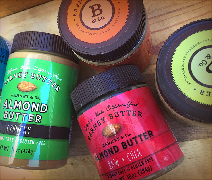
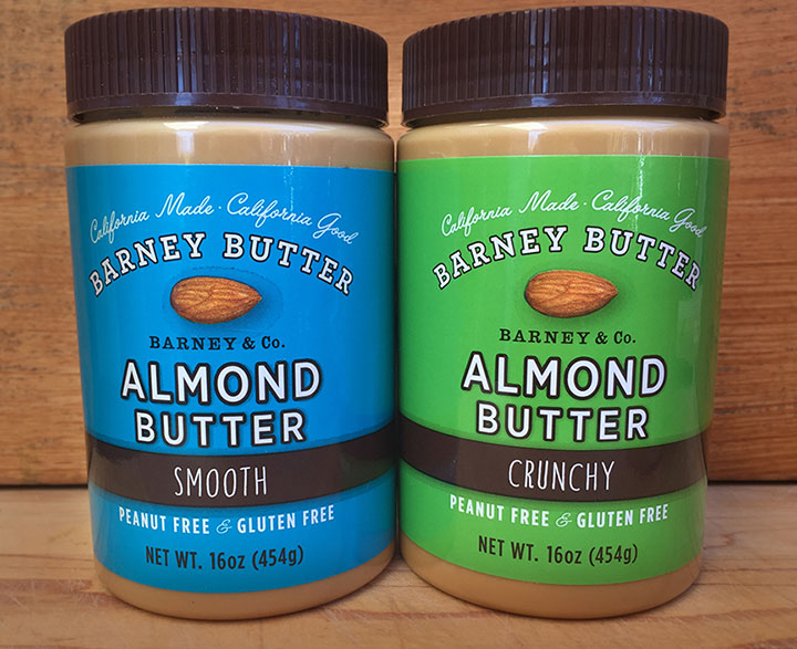
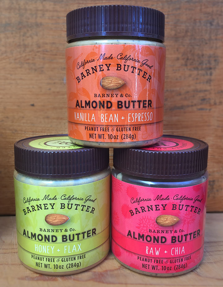
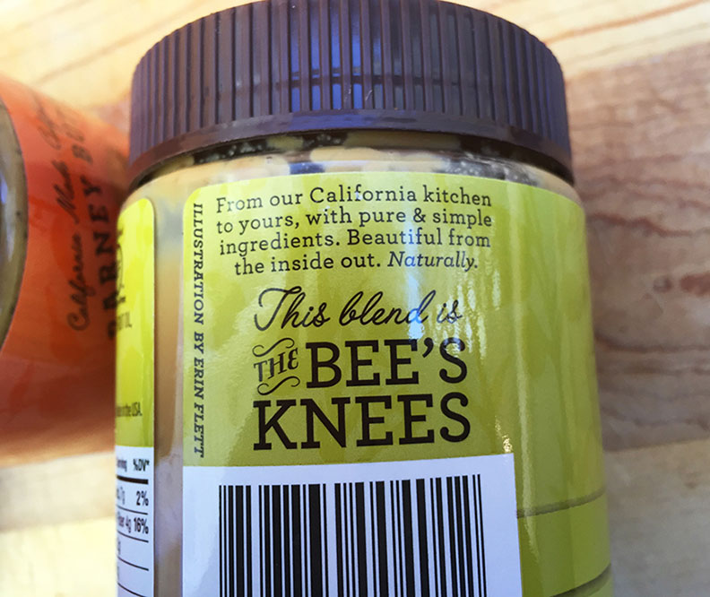
I’m nuts about these almond butters and the packaging too. The color coding is excellent and there’s never any confusion when I’m reaching for the “crunchy” or the “creamy”. However, there would be no point for me to blog about it unless I made some design suggestions. How could the branding be made even stronger across the product line? To start, I would change all of the Barney Butter logos to white, for consistency. Notice how the logo is brown on the 10 oz. jars; it might be difficult to read on the lightest green label (Honey + Flax), so then I would adjust the label color for that flavor. Simple!
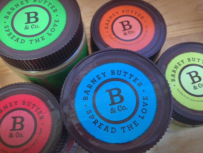
The strongest element that ties the product line together is the lid. However, the flavor name is just too small to read on the 10 oz lids so I would replace it with their great tagline “spread the love”. I spread the love on my toast every morning 🙂
And not to get all geeky-package-designer-technical on you but…
Notice the black “halo” around the almond photo, especially on the blue “Creamy” label? This artifact happens often with this kind of printing, which tells me it’s likely “flexo”. Some printers just can’t print a color gradation to zero percent, so they stop the color at four percent which creates a line or “halo”. It’s prudent to keep this in mind when designing your labels.


Comments