Vanilla Chocolate Confusion
- Lael Porcelli

- Nov 16, 2021
- 1 min read
Package design should only be “black and white” typically in ONE case; its message. It shouldn’t leave you hanging, feeling confused or give you that dreaded “gotcha” feeling on the way out of the store or even worse after you get home.
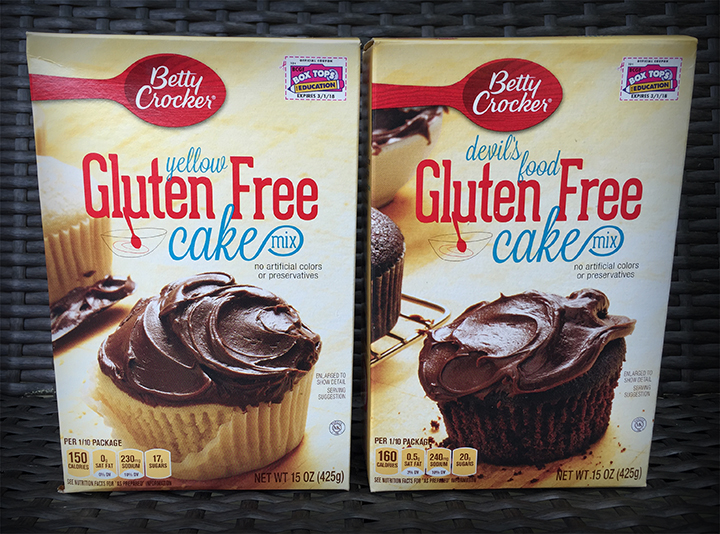
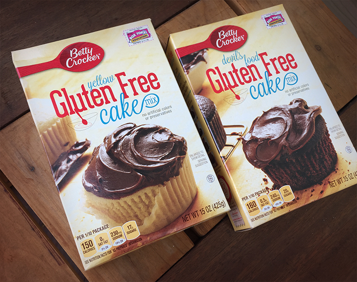
For my husband’s birthday, I decided to make him a cake so I stopped at the grocery store for some gluten free cake mix. I was in a rush and that was the ONLY thing that I needed to buy. I stood in the aisle in a trance staring at the sea of cake mixes, finally I picked up what I thought was the chocolate cake mix and bolted for the register. While standing in line to pay, I realized it was yellow cake mix instead! BACK TO THE AISLE I WENT and struggled to find the difference between the yellow and chocolate cake mix flavors in my harried state.
So what happened? I think the use of chocolate frosting on both cake mix packages threw me off. I would recommend removing some of the chocolate cues from the yellow cake package and adding more chocolate cues to the chocolate cake package. The “yellow” and “devil’s food” type could also be different colors to help boost the differentiation. Any or all of these solutions would help make the message more “black and white”.
Would this have mixed you up too?


Comments